

Published on May 20, 2026
5 min to read
15 Instagram Highlight Cover Ideas to Make Your Profile Stand Out

Summarize with AI

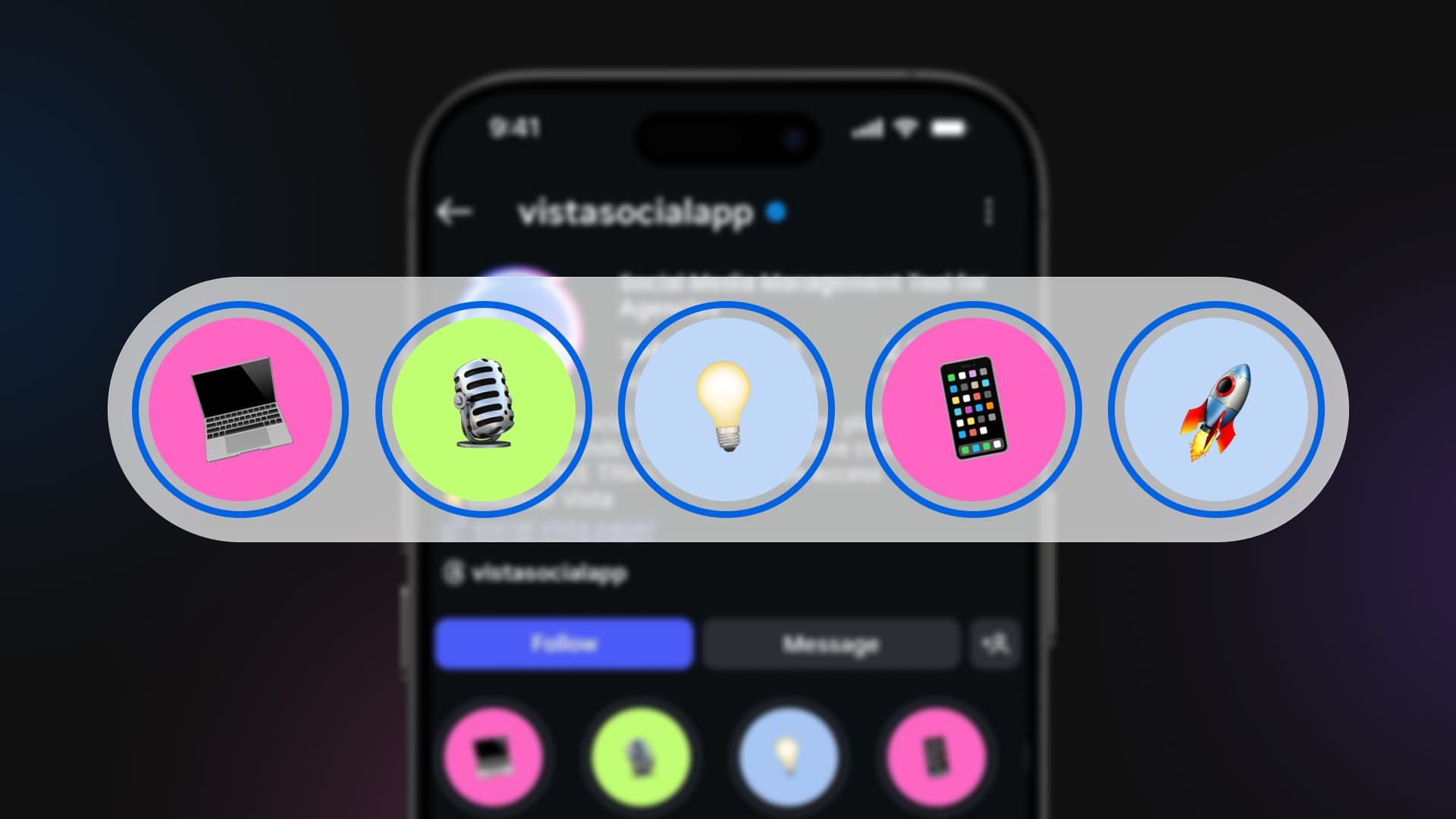
Table of contents
Summarize with AI

ChatGPT

Claude

Perplexity
Share

Vista Social

X (Twitter)


Social media platforms don’t always give you much in the way of branding—so when an opportunity strikes, it’s important you take it. And that’s exactly why you should be putting some serious thought into your Instagram highlight covers.
Instagram highlights sit at the top of your Instagram profile, and other than your profile photo, they’re the only design element you have control over up there.
So take advantage of that and make them stand out! But if you’re not sure how, we’ve got 15 Instagram highlight cover ideas (plus examples of how real brands are doing each one) to get those creative juices flowing.
Table of contents
Tips for designing eye-catching Instagram highlight covers
Before we get into the goods, let’s talk design. Keep these tips in mind as you open up your Canva (or other design app) and start building your highlight covers.
Use one idea across every cover
Either all icons, all illustrations, all photos with the same treatment, or all text. Mixing a hand-drawn icon with a stock photo with a screenshot kills the cohesion you’re trying to build. Pick the idea first, and run with it.
Keep the actual subject inside the safe zone
Instagram crops highlight covers into a circle, but you’re designing on a square (or rectangle—you can select highlight covers from story-sizes images) canvas. So anything in the corners gets cut off.
Center your icon or word and leave generous padding around it. A 1080×1080 file with the focal point inside the middle 720×720 area is a safe starting point.
Make the icon readable at thumbnail size
Highlight circles render at roughly 60 pixels on most phones. A detailed illustration that looks great in Figma turns to mush at that size. Test by zooming out until the cover is the size of a fingernail. If you can’t tell what it is, simplify.
Label by category, not by post
Think categories like “Recipes,” “Reviews,” “Behind the scenes,” “FAQs.” Specific enough to be useful, broad enough that you’re not making a new highlight every week. The cover should reinforce the label, not compete with it.
Match the cover style to what you actually do
A food blogger’s covers can lean photographic. A B2B founder’s covers should probably lean iconographic and clean. A meme account can get away with breaking every rule above. The covers are a preview of the content behind them, so make them honest.
15 creative Instagram highlight cover ideas
Now let’s get on with it. If you’re not sure what to do with your brand’s Instagram highlight covers, here are 15 ideas (plus examples) to help you find the right match for your designs.
1. Use emoji
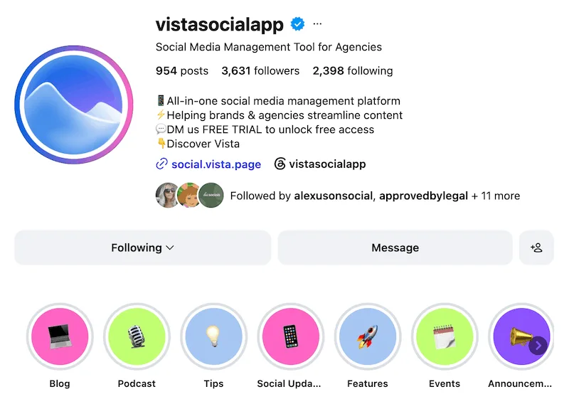
What is social media without emoji? That’s exactly where our head went when we designed our highlight covers. Plus, we regularly incorporate emoji into our branded designs, so it just made sense.
There are 3,953 standardized emoji, so there are bound to be a few related to your industry. Why not have some fun with emoji in your highlight covers?
2. Use your brand colors
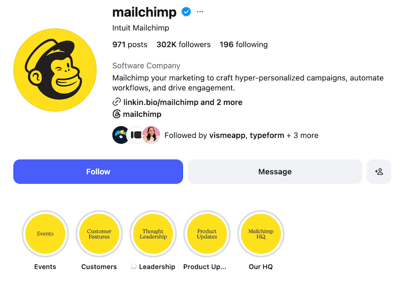
I already talked about how your highlight covers are the only other place at the top of your profile that you can really infuse your branding. So take serious advantage of that and make your profile appear as *you* as possible.
Mailchimp does a fantastic job of this by bringing its iconic yellow into everything it possibly could on its Instagram profile. But you can honestly incorporate your brand colors alongside any number of the ideas in this list.
3. Use icons
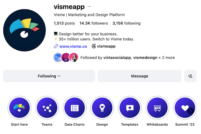
Simple but strategic. Find icons online (there are so many different kinds—single-colored, multi-color, outline icons, etc.) that represent your different highlight categories and place them on a branded background. Boom, perfect highlight covers!
4. Use images
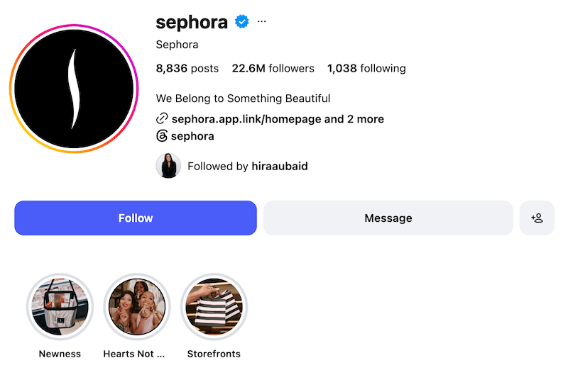
Get high-quality images that represent your product or service and use those as highlight covers. This is a lesser-used idea, so you’ll be sure to stand out.
5. Use solid colors
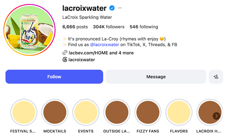
This is an extremely simple Instagram highlight cover idea that I love. Literally just get solid graphics that you can upload. But what’s really fun about how La Croix has used this is that you can see the colors right now match the coconut flavor in its profile photo as that was a recently launched flavor.
This means La Croix can swap out the colors in its highlight covers each time it launches a new flavor, helping the new product stand out and using color in a fun way on its Instagram profile.
6. Use text
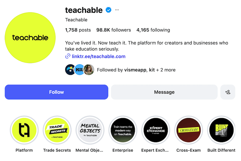
Keep it simple with just text names on your highlight covers. Teachable takes this to the next level by creating a new text design for each of its highlight categories, but you can also literally just use your brand font. Whatever you want; the sky is the limit!
7. Use illustrations
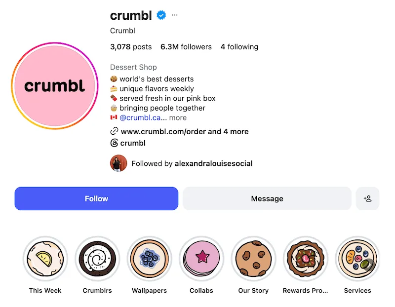
Okay, we love how Crumbl has taken this idea and run with it. Get the designer on your team to hand-design some illustrations. Bonus points if those illustrations are of absolutely delicious cookies.
8. Use product images
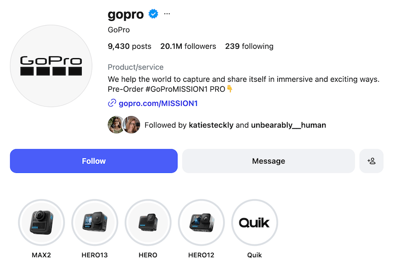
If you just want to talk about your product(s) in your highlights, product photos like GoPro has done here is perfect. Each highlight consists of photos/videos taken with each of the featured products, so a product image as the highlight cover is really just *chef’s kiss.*
9. Be colorful
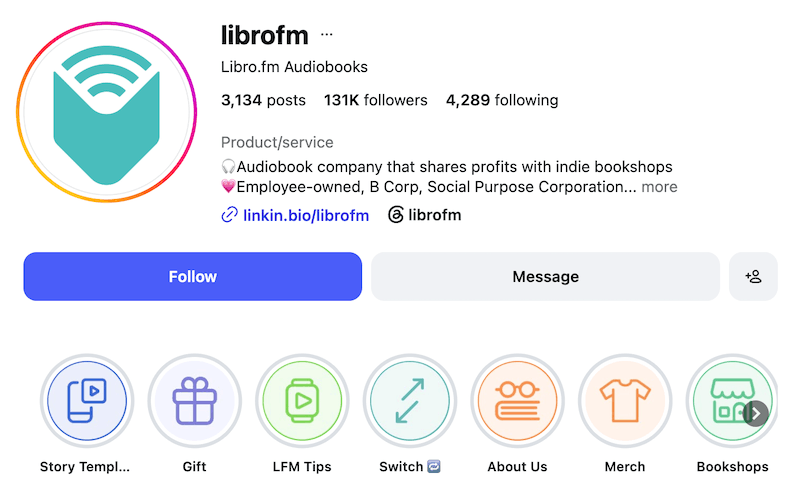
Don’t limit yourself to just your 1-2 brand colors. Take a page out of Libro.fm’s book and incorporate multiple colors to make your profile bright and eye-catching.
10. Be neutral
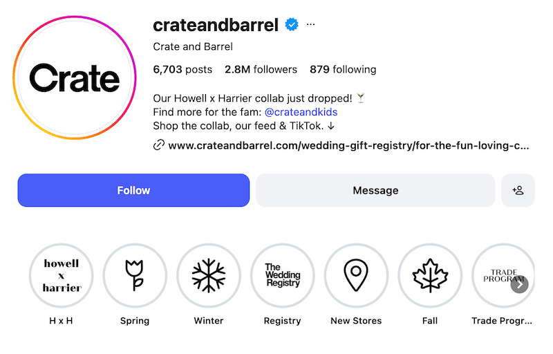
Or, if minimalism is more your thing, keep it neutral with black and white, beige, and other neutral palettes. Crate and Barrel did exactly that with their highlight cover designs.
11. Be monochromatic
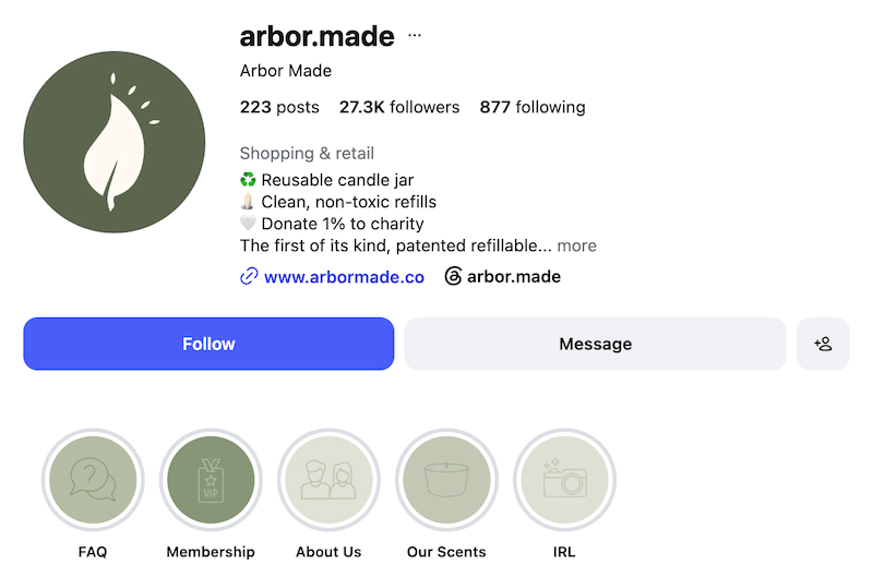
Or if you only have one brand color (or one main color you want to use), you can create a monochromatic palette that incorporates multiple shades of that single hue. Impeccably done here by candle brand Arbor Made.
12. Use gradients
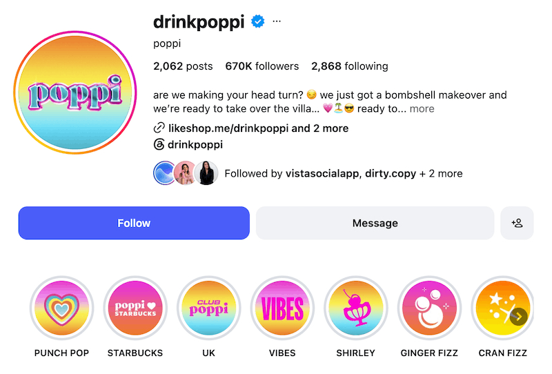
If there’s any platform to use gradients, Instagram is it. Instagram’s logo and the circle that appears around your profile photo if you have an active story are both gradients, so Poppi’s design choices fit in perfectly.
13. Use patterns
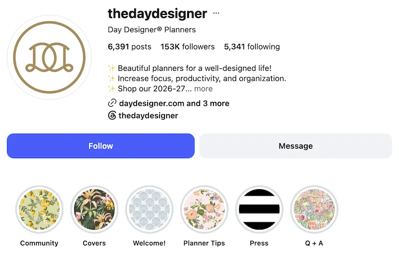
Get creative with different patterns. The Day Designer’s choices here are perfect because they also match the brand’s planner covers. Use patterns that also match your products—or find some that are just pretty.
14. Use abstract designs
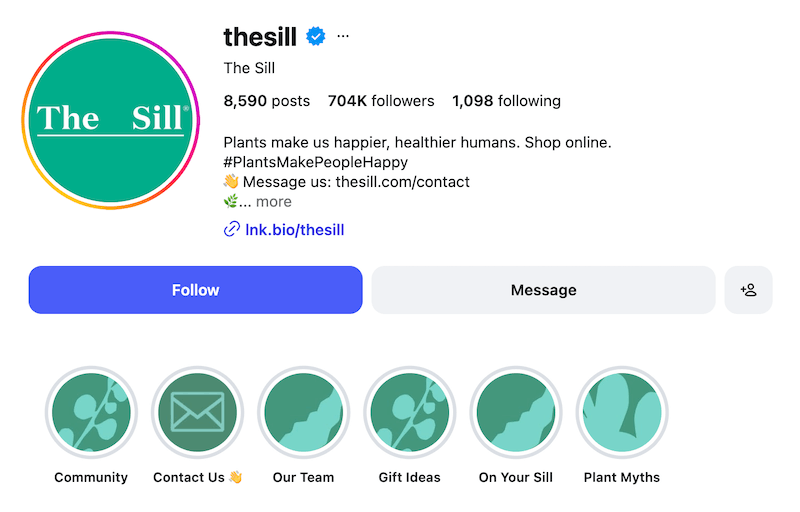
You don’t even need icons, emoji, or elements that perfectly visually represent your categories. You can also just use abstract shapes or design elements that are adjacent to your industry (or just random).
The Sill incorporated plant-like shapes (in its brand colors, of course) as a way to visualize its highlight covers, and we’re here for it.
15. Use translucent image overlays
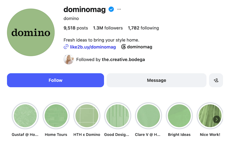
We love this creative way to bring your brand colors into your Instagram profile. Domino Mag used a translucent cover overlay on top of stock images to add some depth to its Instagram presence.
Get inspiration from these Instagram highlight cover ideas
Start gathering inspiration for your own Instagram highlight covers from these 15 creative ideas. Then change them out each season! That’s the best part—nothing is set in stone here.
If Instagram is a big part of your social media strategy, learn how Vista Social can help your brand make an even bigger splash. Start your free trial today.
Try Vista Social for free
A social media management platform that actually helps you grow with easy-to-use content planning, scheduling, engagement and analytics tools.
Get Started NowAbout the Author

Content Marketing @ Vista Social
Chloe West is a content marketing manager for Vista Social. She has over seven years of experience in digital marketing for B2B SaaS companies. When she's not working, you'll find her spending time with her family, reading a book, or watering her plants.
Loading related tools...

The most complete social media management platform for teams who demand more.






Tools
PublishingAnalyticsEngagementIntegrations
FacebookInstagramLinkedInRedditSnapchatThreadsTikTokX (Twitter)YouTubeMCPVista Page (link-in-bio)All IntegrationsCopyright © 2026 Vista Social LLC. All Rights Reserved.